In 2019 I had an awesome opportunity to work with Pips Meadery on a few illustrated label designs for their bottles. The company already has a somewhat 'otherworldly' aspect to their branding, showcasing many alternative, fantasy and fiction inspired graphics, which made it extremely fun and exciting to come up with ideas to suit their creative product names.
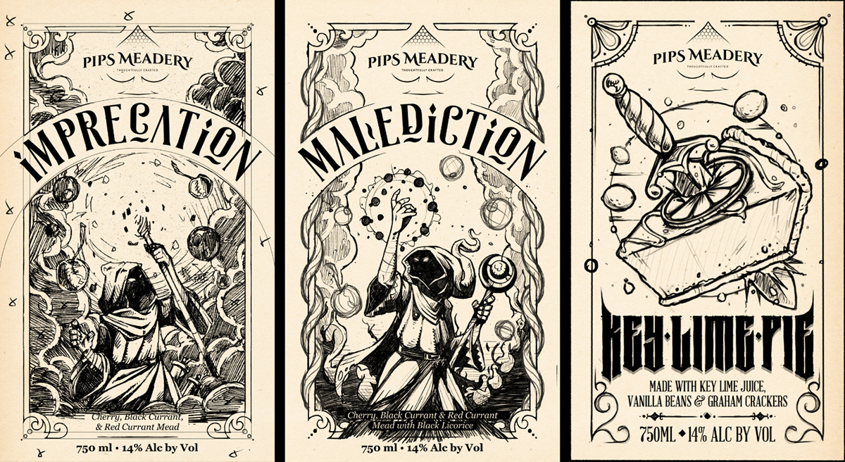
LABEL 1 : IMPRECATION
~
"Imprecation", essentially meaning "curse", was the first label I worked on.
A cherry, black currant and red currant mead.
The illustration depicts a mysterious warlock character, casting a spell and conjuring the ingredients that represent the flavour elements of the mead content.
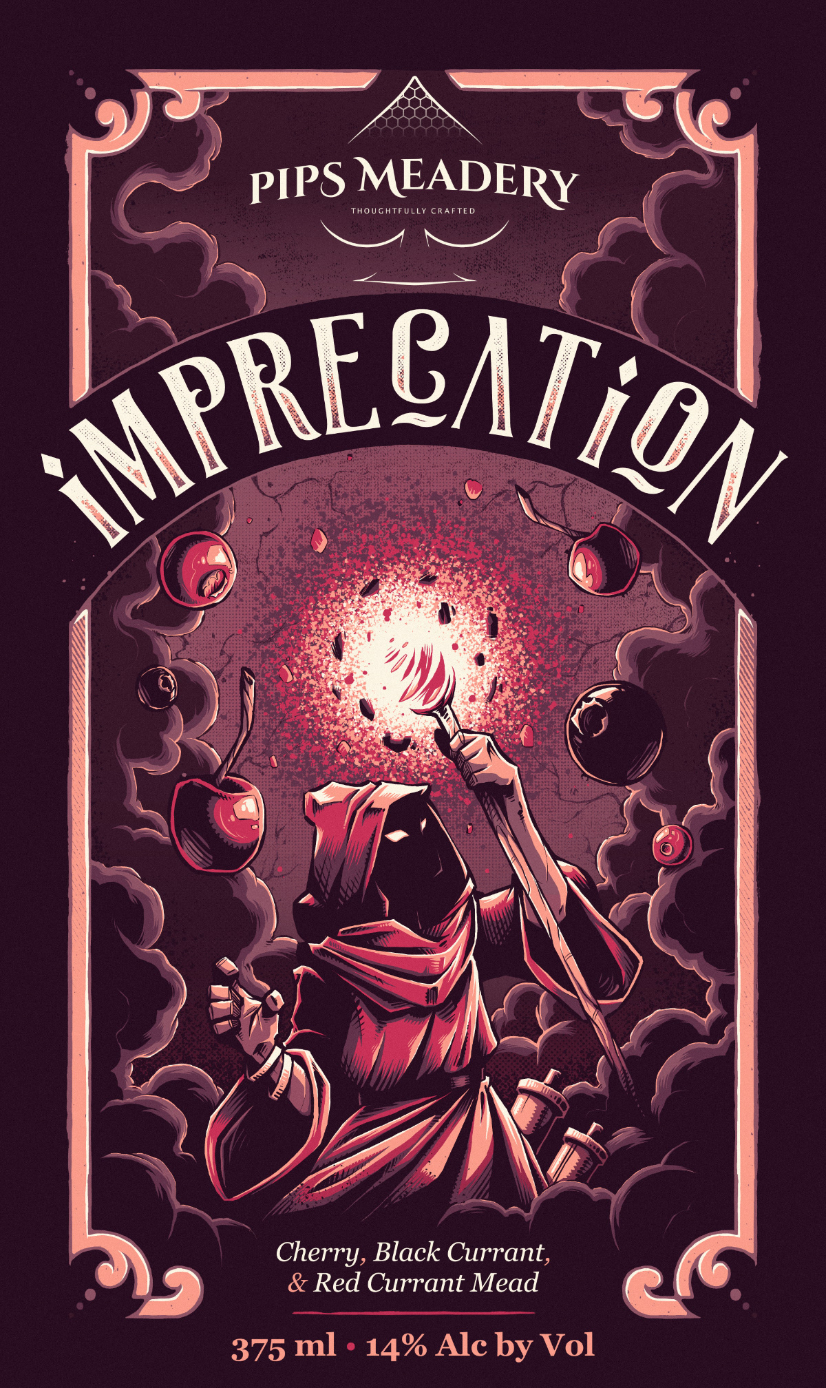
"IMPRECATION"
Final Label Illustration & Design
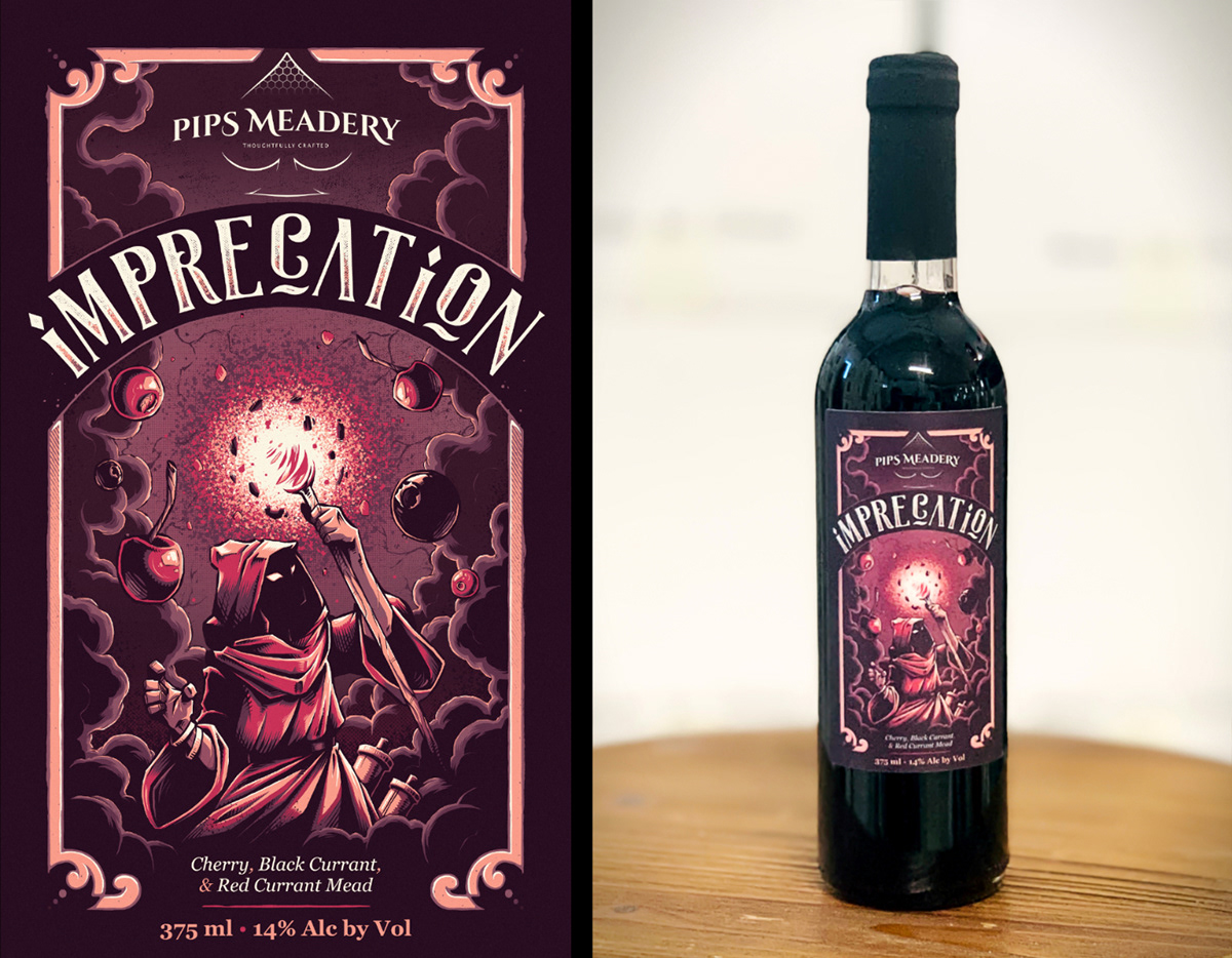
Final Printed Label
LABEL 2 : MALEDICTION
~
"Malediction", is a variant of the "Imprecation" mead.
A cherry, black currant and red currant mead, made with black liquorice.
A variation of the first warlock character was illustrated, with enough similarities to tie into the first label theme, but enough differences to give it its own unique look and feel.
Darker colours were also incorporated to convey the addition of liquorice as an ingredient.
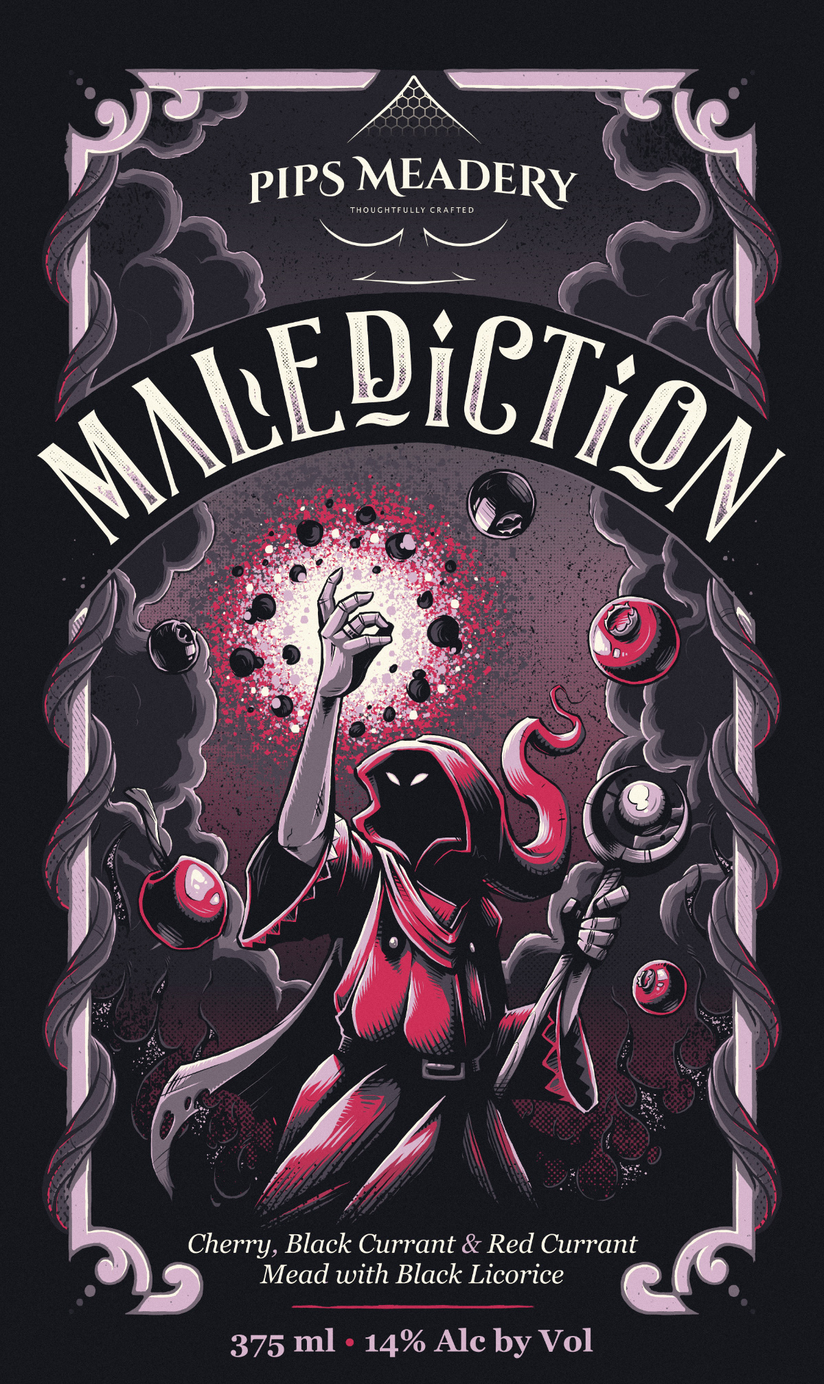
"MALEDICTION"
Final Label Illustration & Design
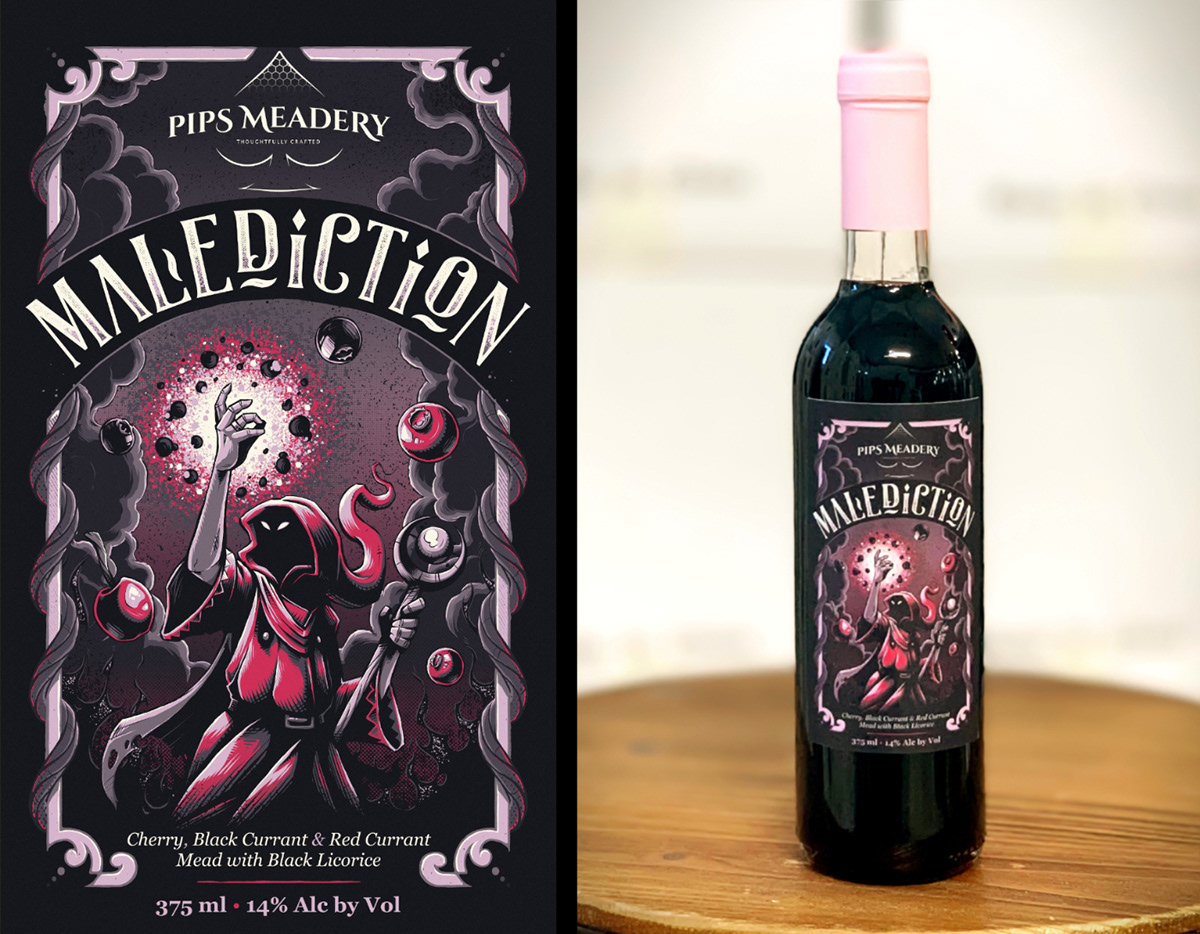
Final Printed Label
LABEL 3 : KEY LIME PIE
~
"Key Lime Pie", as the name suggests, is an interesting mead infused with the vivid flavours of key lime juice, vanilla beans, and graham crackers.
We initially experimented with concepts where the main visual was a lime with a keyhole in the centre, but ultimately settled on the idea of a slice of key lime pie with a tattoo style dagger through it, as it created a far more engaging, impactful, and visually appealing design.
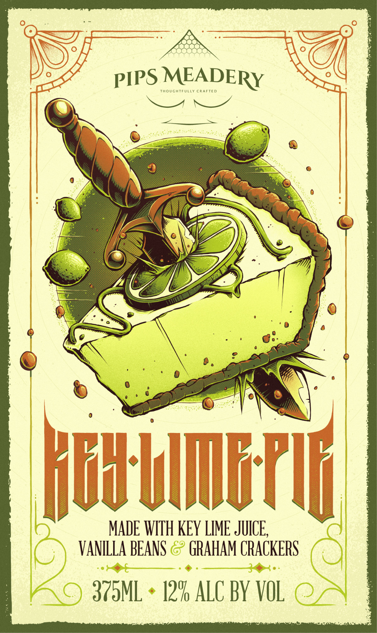
"KEY LIME PIE"
Final Label Illustration & Design
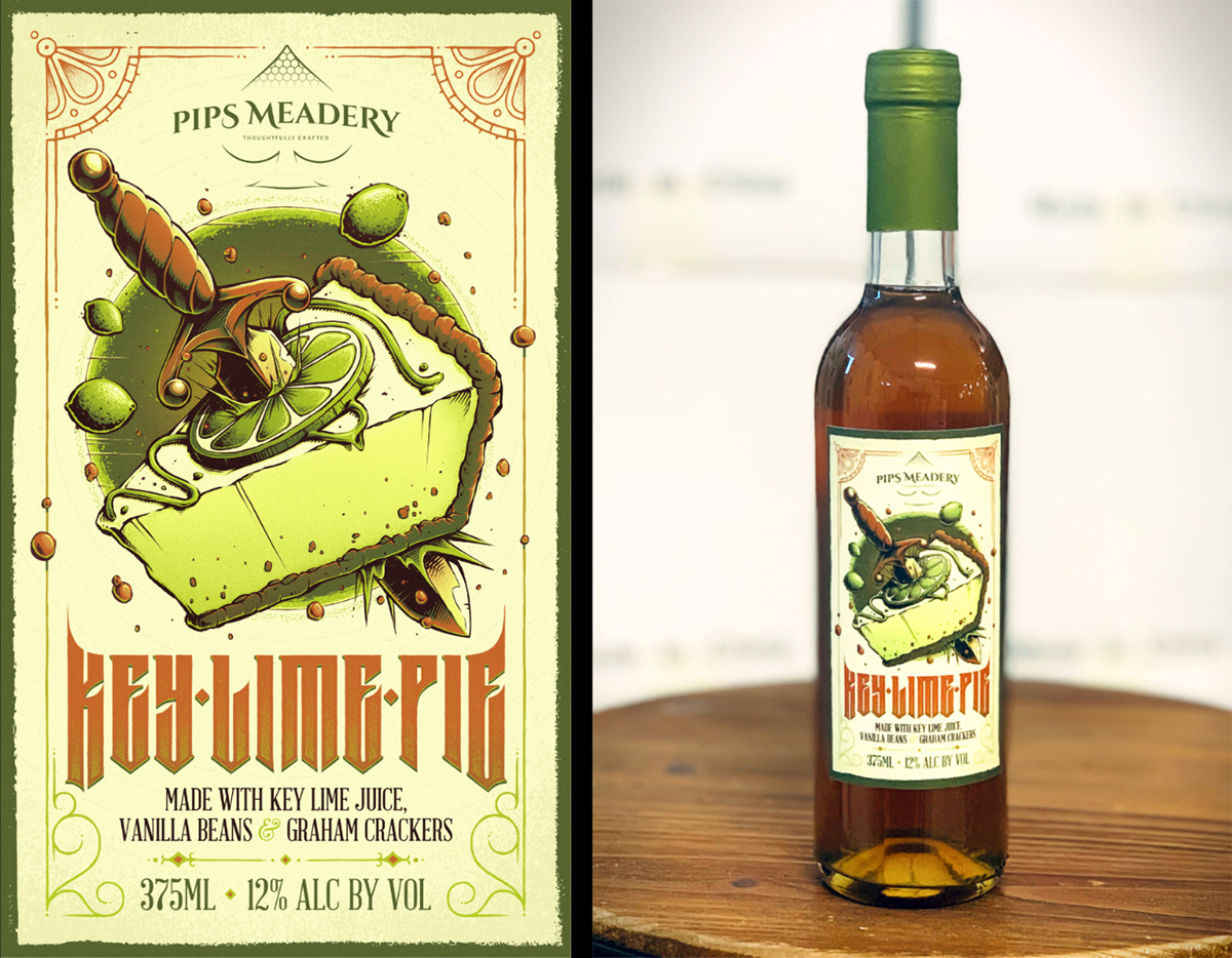
Final Printed Label
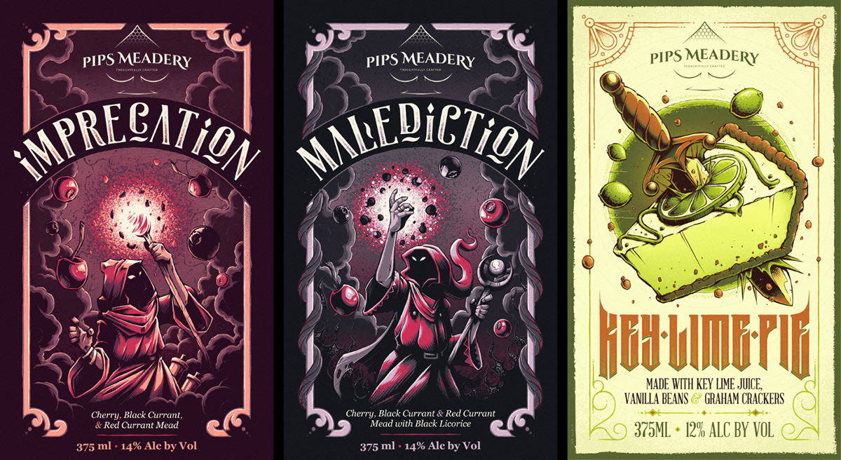
All three labels together, with a fourth one currently in the works! ;)
Initial Concept Sketches

A few photos from Instagram users, found under the #pipsmeadery tag.